Financial app
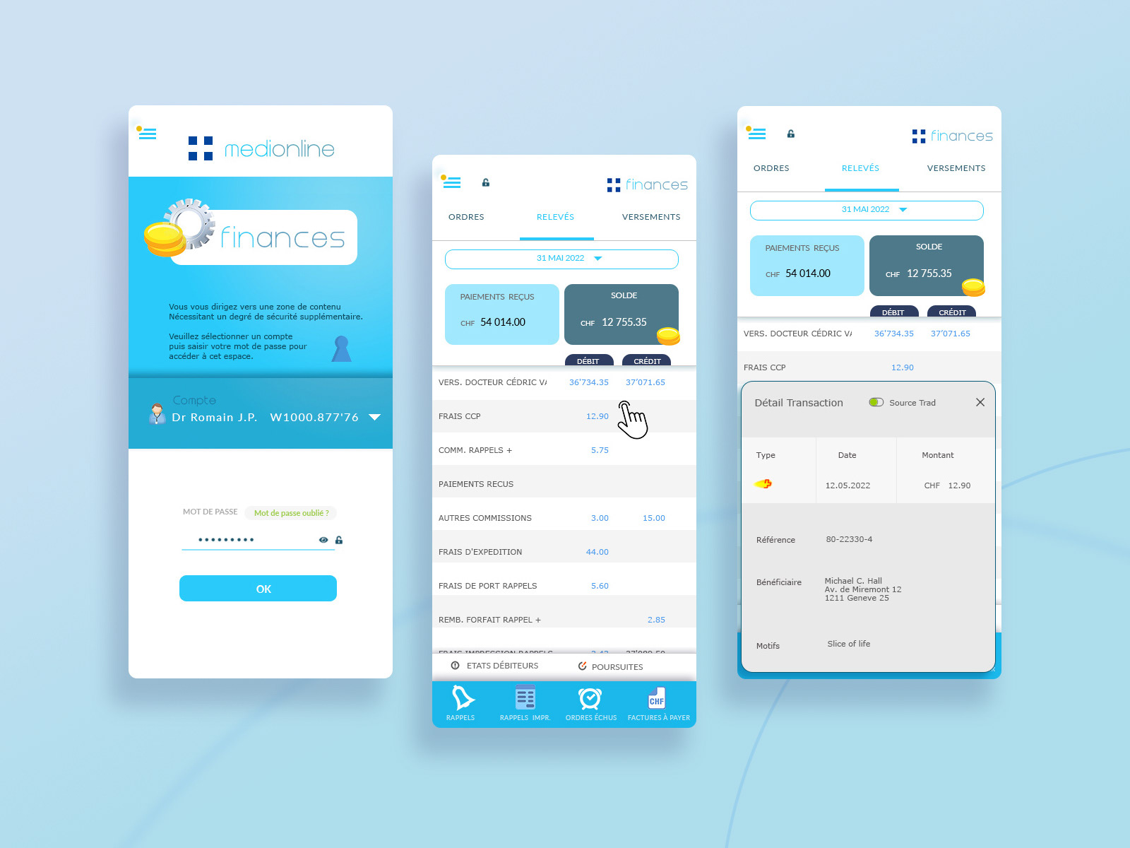
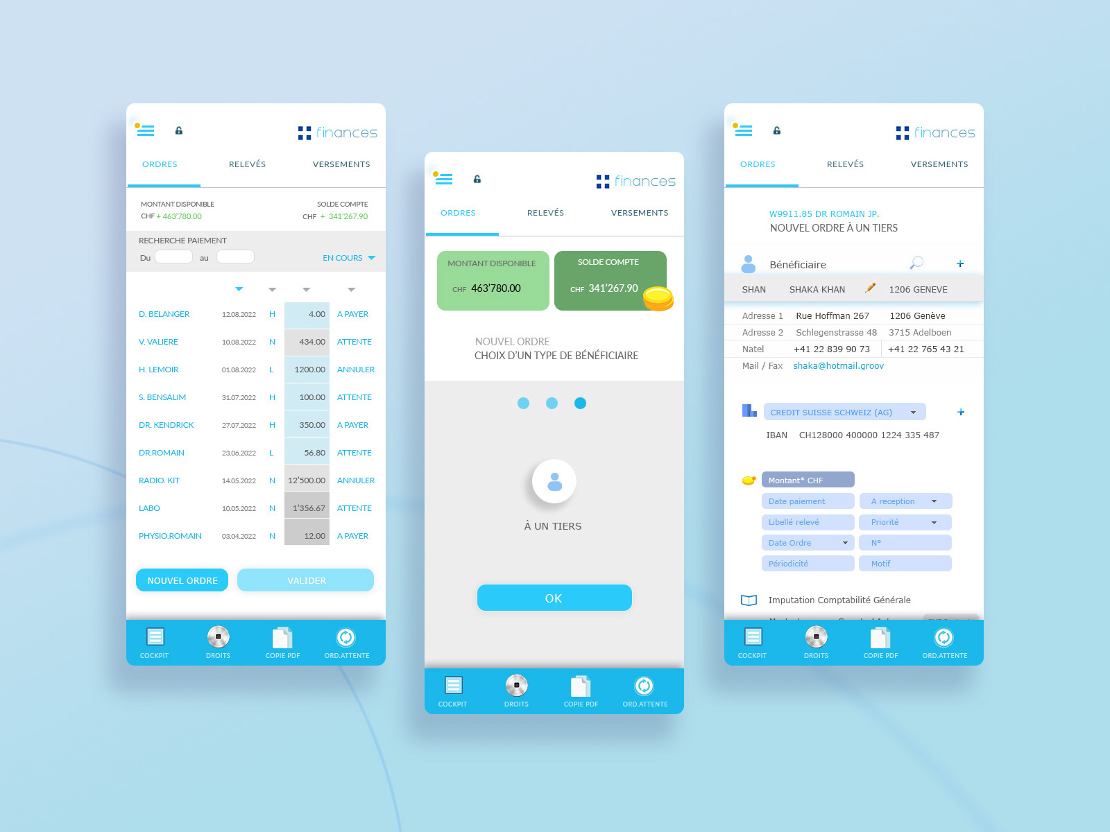
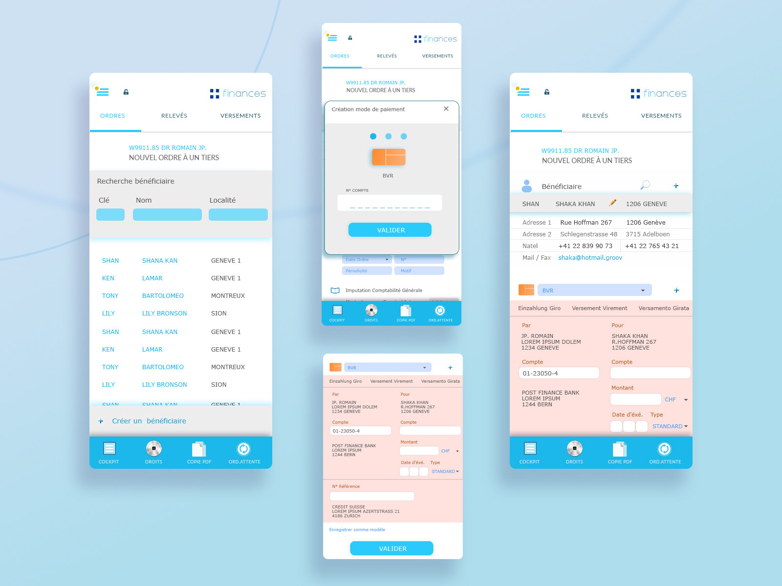
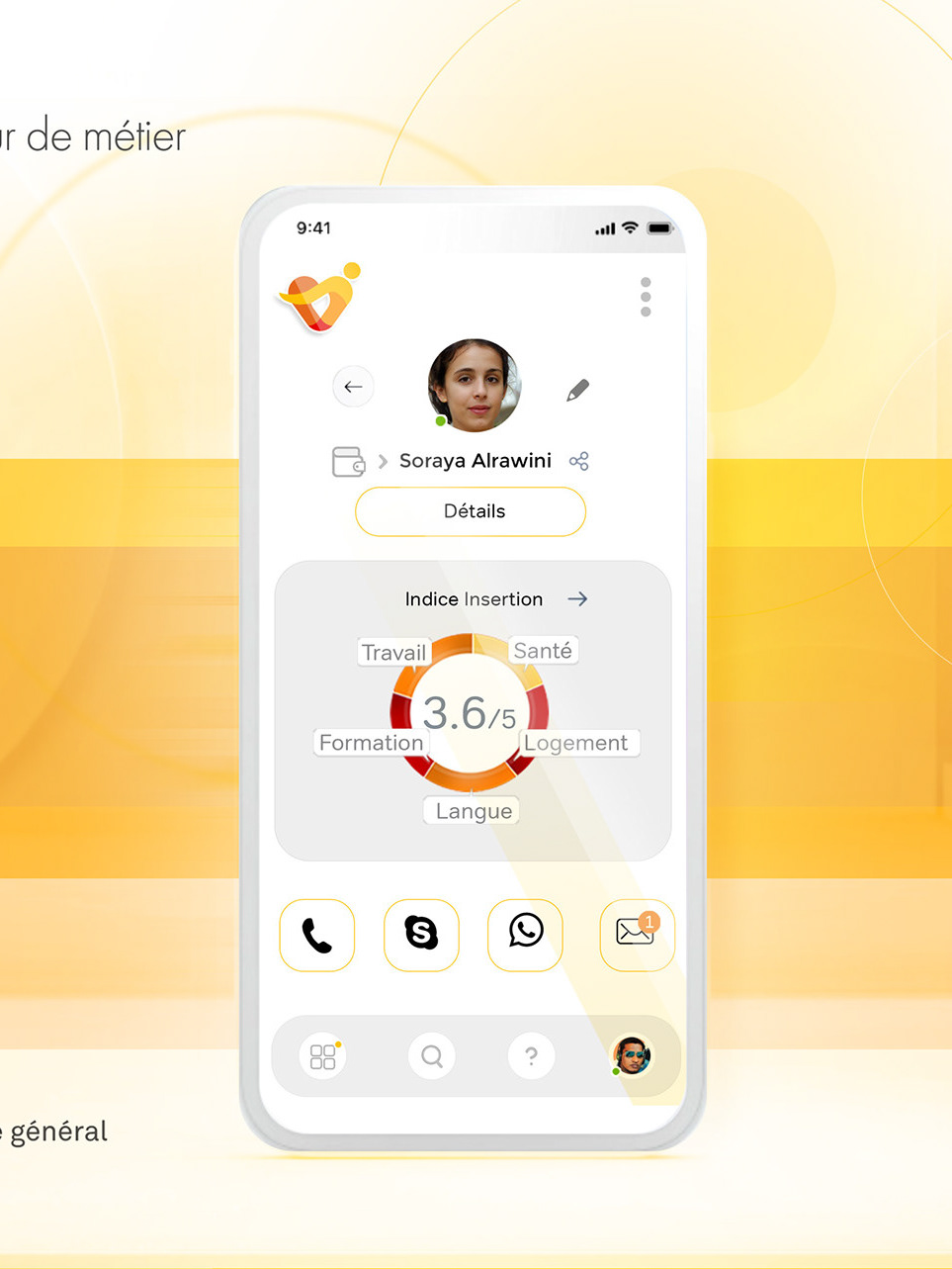
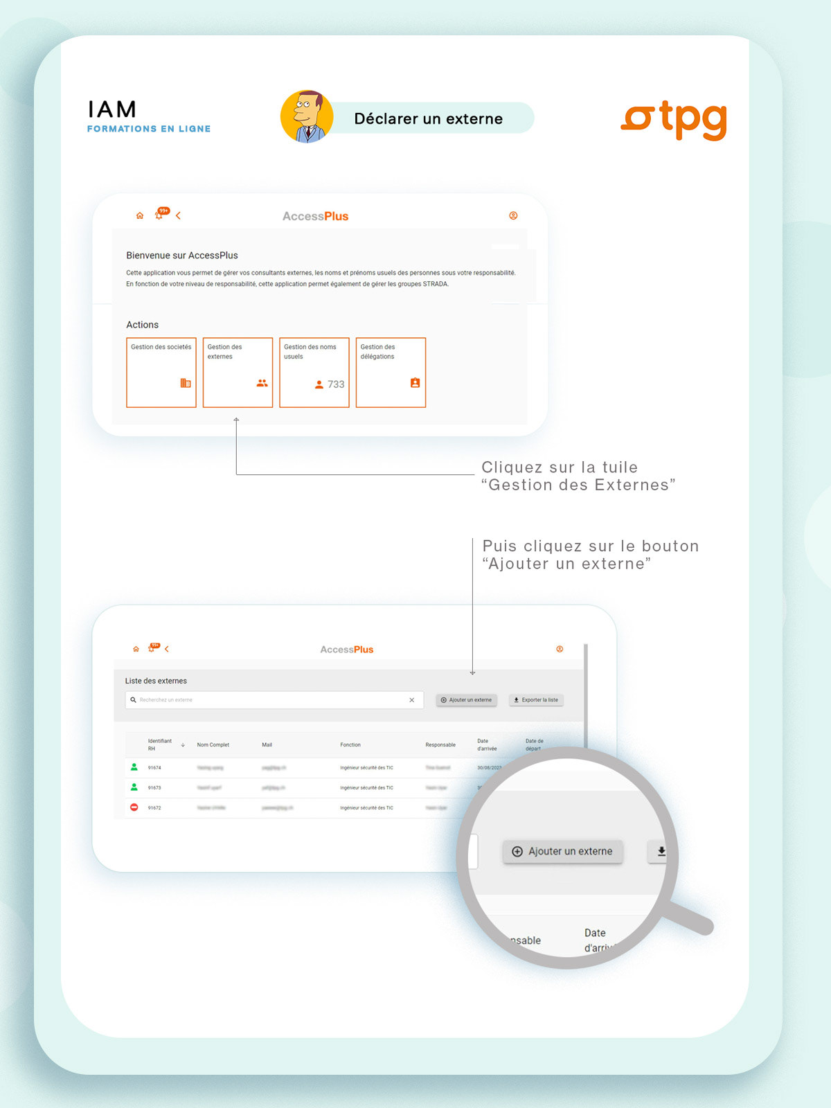
It sometimes happens that the smartphone version of an application is the poor relation of that developed in desktop mode. The exercise on this prototype is to keep the same functionalities and to be able to perform all the "sensitive" operations of the transactions.
It sometimes happens that the smartphone version of an application is the poor relation of that developed in desktop mode. The exercise on this prototype is to keep the same functionalities and to be able to perform all the "sensitive" operations of the transactions.
The idea, to achieve this accessibility objective, is to have a specific mobile application for each task. The information presented must be directly usable for the user.
With 80% less space on smartphone screens, it is essential to limit the density of information and get to the point. This approach involves prioritizing the information to adapt to this constraint and therefore distributing the content over several successive screens.
MediOnline / Caisse des Médecins AKCM
